Designing Clarity in Complexity: How a Unified Dashboard Empowered Advisors to Make Smarter, Faster Decisions
Senior UX Designer
Staff Product Designer
Q3 2018, Q2/3 2021, 2023
Product Strategy, Research, UI/UX design, Interaction design, Prototyping, User Testing, Training, Documentation
Role
1 Product Designer (myself)
VP of Product
2 Product Managers
4 UI Developers
QA Engineers
Sales
Customer Success
Team
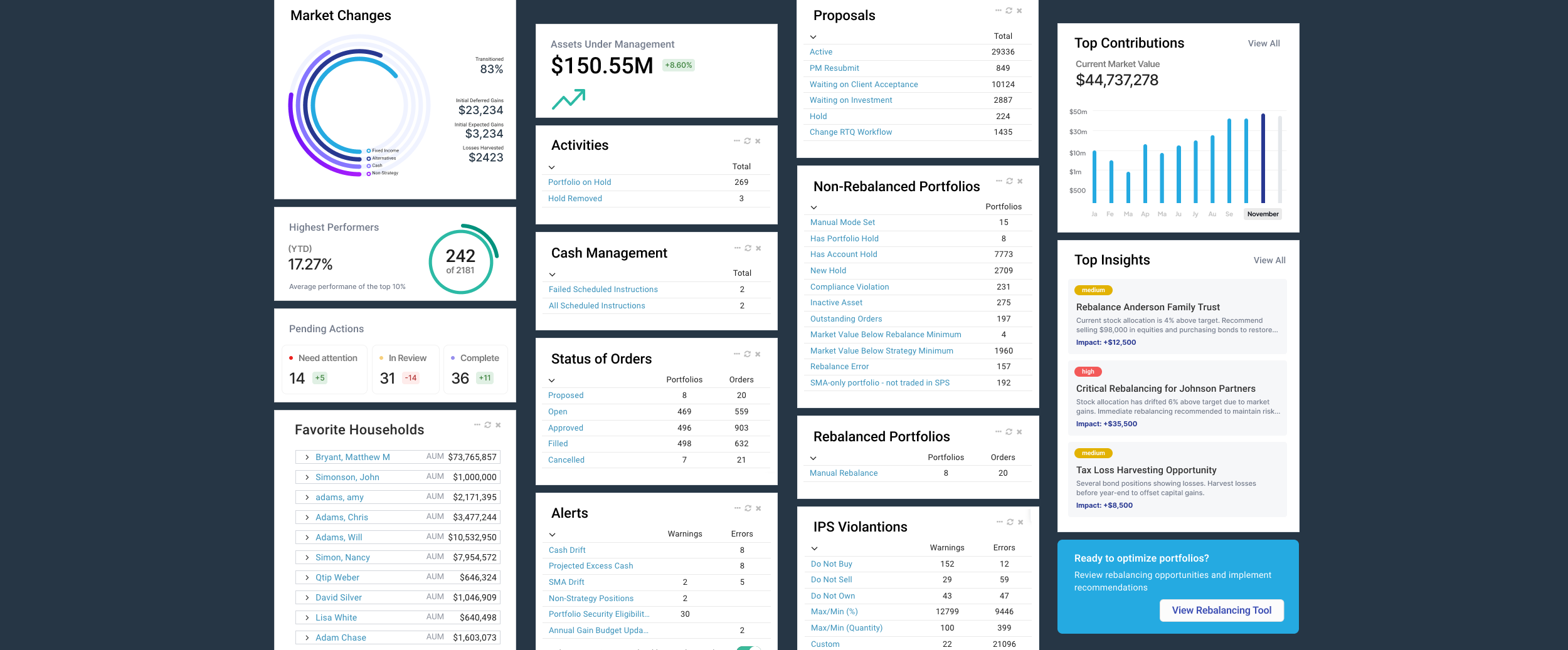
MyVest’s SPS platform powers personalized portfolio management for enterprise wealth managers.
Challenge: Advisors and overlay portfolio managers needed a faster, more actionable way to interpret complex data across households, portfolios, and accounts.
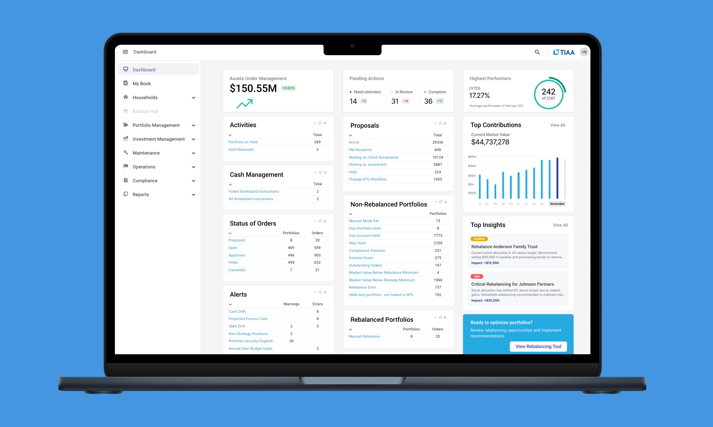
Solution: Create an Advisor and Portfolio Manager Dashboard that transforms complex operational data into clear, contextual insights through a best-in-class, configurable experience.
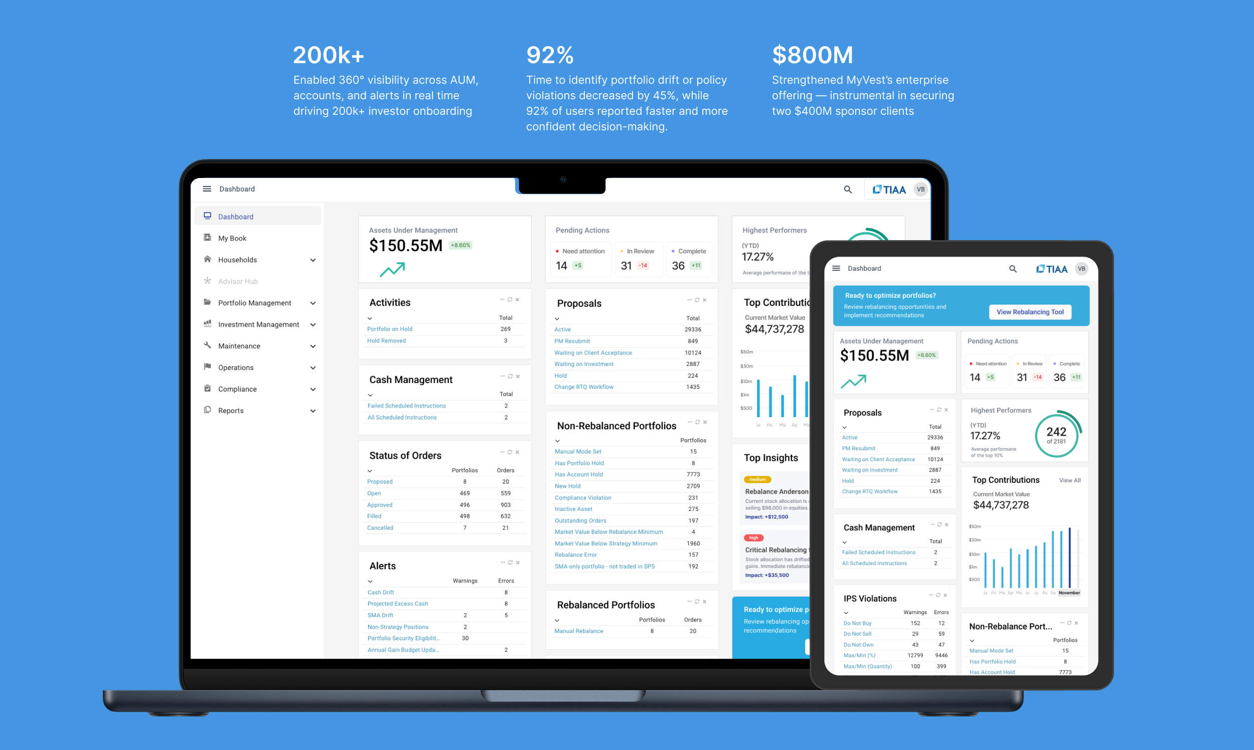
Impact: Increased operational efficiency and reduced performance inquiries by 92%, securing two $400M enterprise clients within months of launch.
CLIENT OUTCOME
200k+
Enabled 360° visibility across AUM, accounts, and alerts in real time driving 200k+
investor onboarding
92%
Time to identify portfolio drift or policy violations decreased by 45%, while 92% of users reported faster and confident decision-making.
$800M
Strengthened MyVest’s enterprise offering — instrumental in securing
two $400M sponsor clients

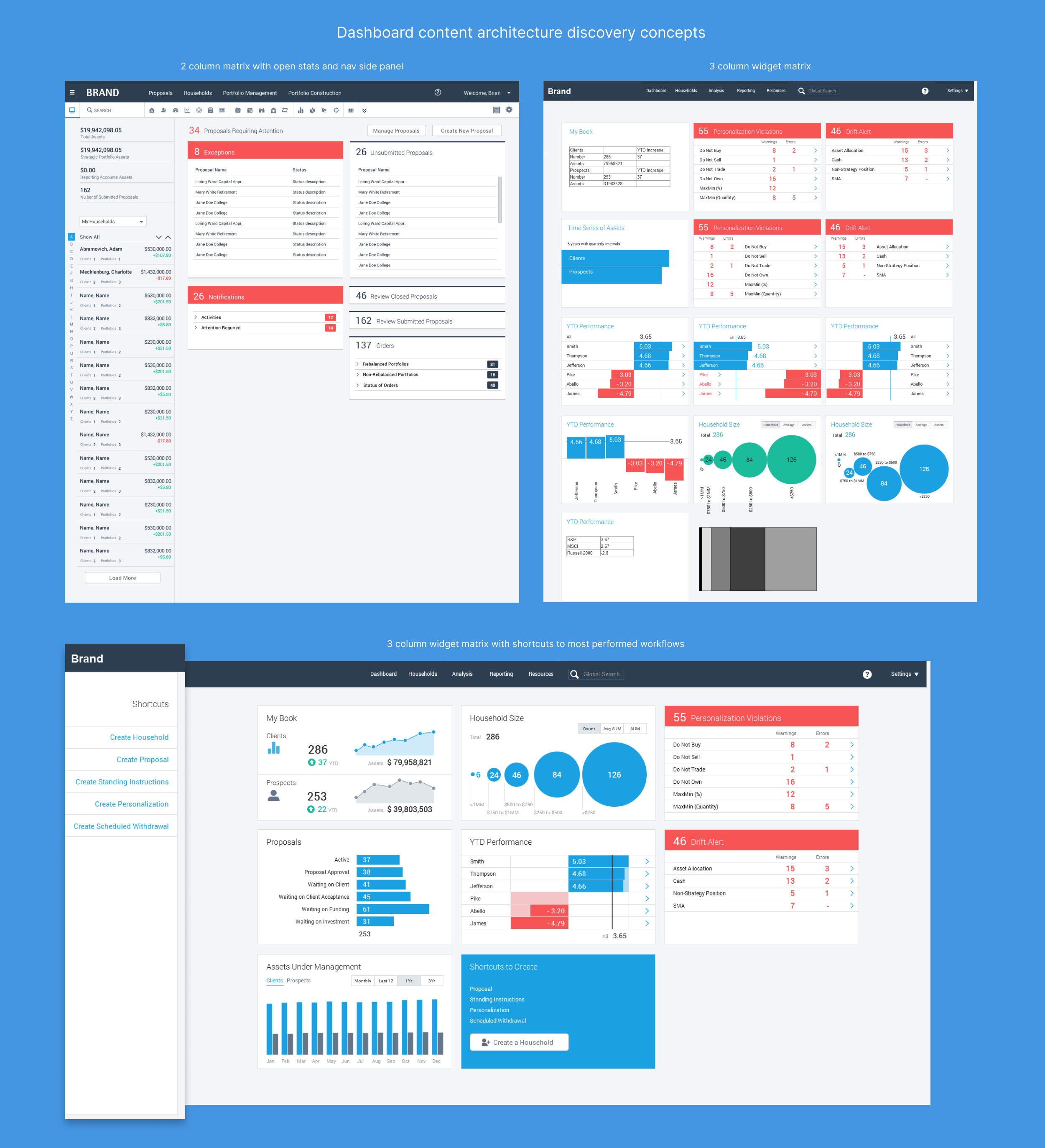
Discovery
Early research and target audience interviews revealed key pain points:
Advisors juggled multiple tools and reports to monitor portfolio drift, tax events, and account exceptions.
Overlay managers required operational visibility into trading workflows and drift alerts across thousands of portfolios.
Both groups struggled with information overload — large data grids, inconsistent navigation, and lack of visual prioritization.
From stakeholder interviews and SPS usage analytics, three opportunity
areas emerged:
Consolidate high-frequency actions and alerts in one customizable dashboard.
Enable real-time situational awareness (drift, exceptions, AUM changes) through visual indicators.
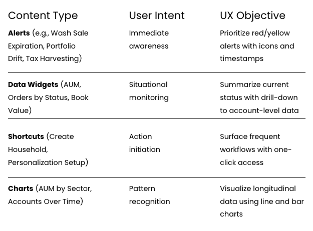
Introduce a tiered information model — “Things to Know,” “Things to Act,” and “Things to Analyze” — aligning with each user’s cognitive workflow.
Ideation
Using insights from the discovery interviews and the critical dataset analysis led to mapped content types to user intents:

Design
Layout and Information Architecture
Adopted the “Three Zones” model: Awareness (Alerts) → Action (Shortcuts) → Analysis (Charts & KPIs).
Key metrics (AUM, Drift %, New Accounts, Tax Harvesting Events) appear at the top of the dashboard, guiding the advisor’s eye.
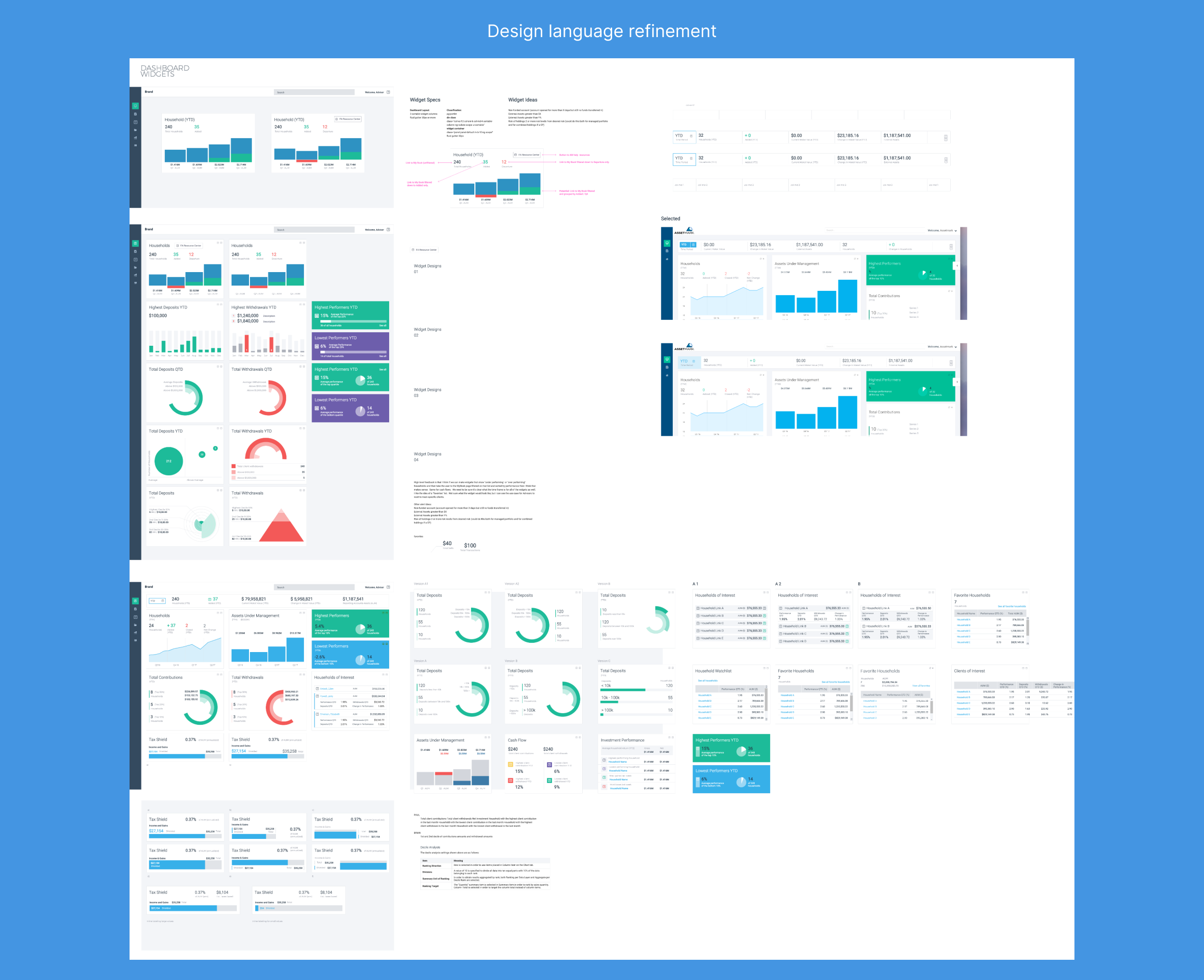
Visual Design
Leveraged high-contrast colors and typography for fast scanning.
Incorporated role-based defaults: Advisors see client-level performance; overlay managers view cross-book trends.
Used consistent charting conventions (time-series line charts, treemaps for allocation, bar charts for growth rates).


Customization
All widgets are drag-and-drop movable and resizable; advisors can tailor dashboards per workflow.
Sponsors can define a default “starter layout” per role, ensuring brand and compliance consistency.
Usability Testing
Prototypes were tested with 12 advisors and 6 overlay managers from three sponsor firms.
Key findings:
92% found it “easier to identify high-priority accounts.”
Time to identify drift or policy violations dropped by 45%.
Users appreciated the modular customization but requested clearer save/persist behaviors.
Iterative refinements included:
Simplified filter controls and consistent use of sponsor terminology.
Introduced contextual breadcrumbs for navigation clarity.
Enhanced contrast for alerts to improve readability on mobile displays.
Challenges
Balancing data richness with cognitive load: The team had to reduce dashboard clutter while preserving analytical depth.
Sponsor branding vs. design consistency: Each enterprise wanted visual flexibility; we resolved this through a shared design system with color and logo overrides.
Real-time performance constraints: Integrating live drift data and overnight processes required optimization of data queries to maintain sub-second load times.
Improvements
Introduced role-based personas within configuration, aligning available widgets to user needs.
Added multi-format outputs (on-screen, PDF, Excel) for executive reporting.
Embedded call-to-action prompts — e.g., “Review Drift” or “Execute Rebalance” — linking insights to SPS workflows.
Future phases include predictive analytics (“Portfolio at Risk” scoring) and cross-firm benchmarking.